General Design
Best Practices
- Fonts & colors: check font size and color contrast against accessibility standards. To check the optimal contrast for type foreground/background color you can use this tool https://accessible-colors.com/
- Buttons: should be a min height of 40px (Apple recommends 44px) for a reasonable tap area.
- Forms and inputs: automatically pre-fill values in fields where possible, and let users know which fields are required (or just which are optional)
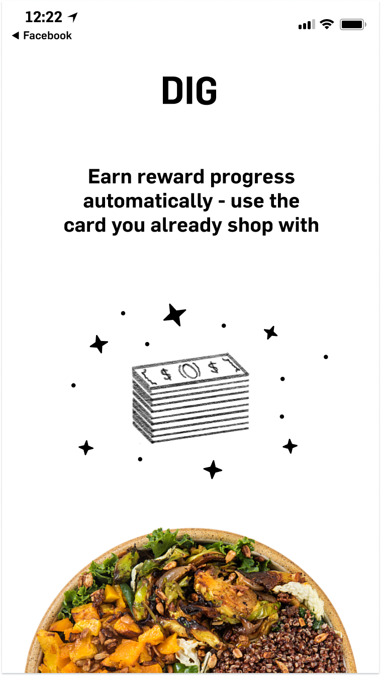
- Graphics/animations: use to help illustrate concepts and create delight. (If using animations make sure they aren’t blocking the user from moving forward)
Example: Dig uses their own playful illustrations to add delight
- Capitalize on opportunities to increase enrollment through incentives
- Ensure all legal text is present, legible and that our ToS and Privacy Policy are darker and underlined.
- Don’t break design conventions or patterns unnecessarily, especially when it comes to the navigation of your app.
User Accounts
- For ordering apps, reduce administrative burden by allow users to start using the app without creating an account. This means users can skip your onboarding experience and they can view the home page as well as start adding items to cart.
- However, if users want to check out or to access their Rewards or Account pages, you should require that the user either create a new account or log in to an existing account.
Sign up
Card enrollment at signup
- When prompting users to sign up in order to access the Rewards or Account pages, you may choose to use a longer account creation flow. In this flow you will collect the user’s email and . You may also add a step to ask user to enroll their credit card into the loyalty program.
- Capturing credit card data is crucial in helping build out a comprehensive understanding of your customers behavior, and in turn allows you to target the right customers at the right time, for increased engagement and marketing ROI. This also benefits consumers because it creates a seamless way for them to earn rewards when they make purchases. Earning progress is as easy as swiping their credit card.
- For non-ordering focused apps i.e. malls, retail, etc, card capture at signup is particularly crucial; this is a time you have the users focus and attention, and can highlight the values and incentives for enrolling their card.
General Best Practices
- Ensure consumers have clarity on how to earn progress. We recommend that experiences with digital ordering ensure consumers can enroll a card when they pay, and if they pay with a card that isn’t enrolled (or with Apple Pay for example) the landing screen after payment is complete prompts the user with the opportunity to enroll. Where customers can browse the rewards available to them, we recommend an alert to warn customers they are not automatically earning progress if they have no card enrolled. You can also include the prompt in the onboarding flow to maximize the total number of cards enrolled as an additional option.
- Don’t ask for all of the user’s information at once during signup.
- After account creation, take the user to a page with rewards, ordering or generally something that they can immediately engage with.
- Highlighting the details of the signup incentive prominently in the signup flow is recommend, as it has been proven to increase user enrollment conversion.
- Separate out sign up and log in into separate actions (using a single UX input has proven confusing to users).
- When possible, pre-fill forms with known info.
Log in
Best Practices
- After the user submits their email to log in, they are presented with a screen confirming that a magic link was sent to their email. On that confirmation screen include a CTA to open the email app on the user’s device.
- Provide a means for user to resend the magic link email from screen indicating email has been sent
- Debounce resend button so user doesn’t press it multiple times in one attempt
Saved Cards
Cards list
Best practices
- Ask for the minimum information required to link a card.
- For ordering apps, you need card number (PAN), expiration, CVV and zip
- For apps where a card doesn’t need to be linked for payment, just ask for PAN
- Integrate Dyneti or a similar library that allows cards to be captured via camera
- For ordering apps, users should be able to enroll cards for rewards previously only saved for payment and vice versa.
Account
Best Practices
- Users should be able to edit their info including their name, email, phone, and birthday
- Users should be able to log out of the app, but it does not need to be over-emphasized. (You don’t want users to log out)
Rewards
Best Practices
- Remove the earn description - it isn’t editable in our system (this is on the rewards detail page where it says “for being awesome”).
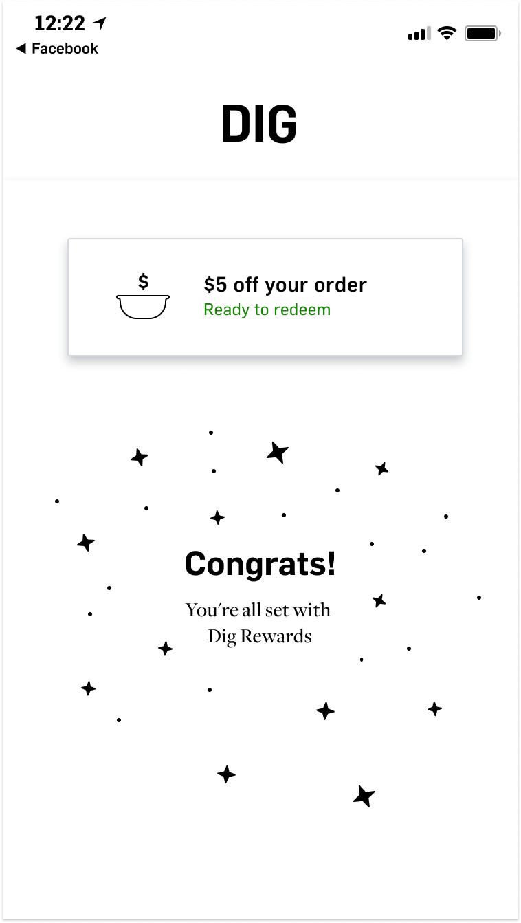
- If you choose to make a card required as part of signup, give the consumer a reward they can use right away, i.e. $5 off rather than reward progress (will give them a more tangible incentive, that they are more likely to respond to).
- Set up all the rewards you want to use on the rewards page of your dashboard. Those rewards will be available to be used in any campaign.
- $ or % off will appeal to a larger audience than giving away a free item.
- Use campaigns in the merchant dashboard to learn what kinds of rewards are most effective for your audience.
- Talk to your customer success manager for best practices about loyalty and intro rewards.
Receipt Upload
Best Practices
- Experience should allow the user to choose a credit card to associate the receipt with, if they have any.
Customer Feedback/NPS
What this is
- After a customer places an order, or makes a purchase, they are occasionally prompted to give feedback about their experience.
- The feedback and ratings that result from this show up in your merchant dashboard; this allows you to target customers based on their satisfaction with your brand.
Why you should include this
- Increases frequency of visit to store
- Gives you a private channel to your customers, so they don’t go to external places such as Yelp with a negative review.
- Additionally, we recommend you prompt your customers for app store rating after they have placed an order or redeemed a reward.