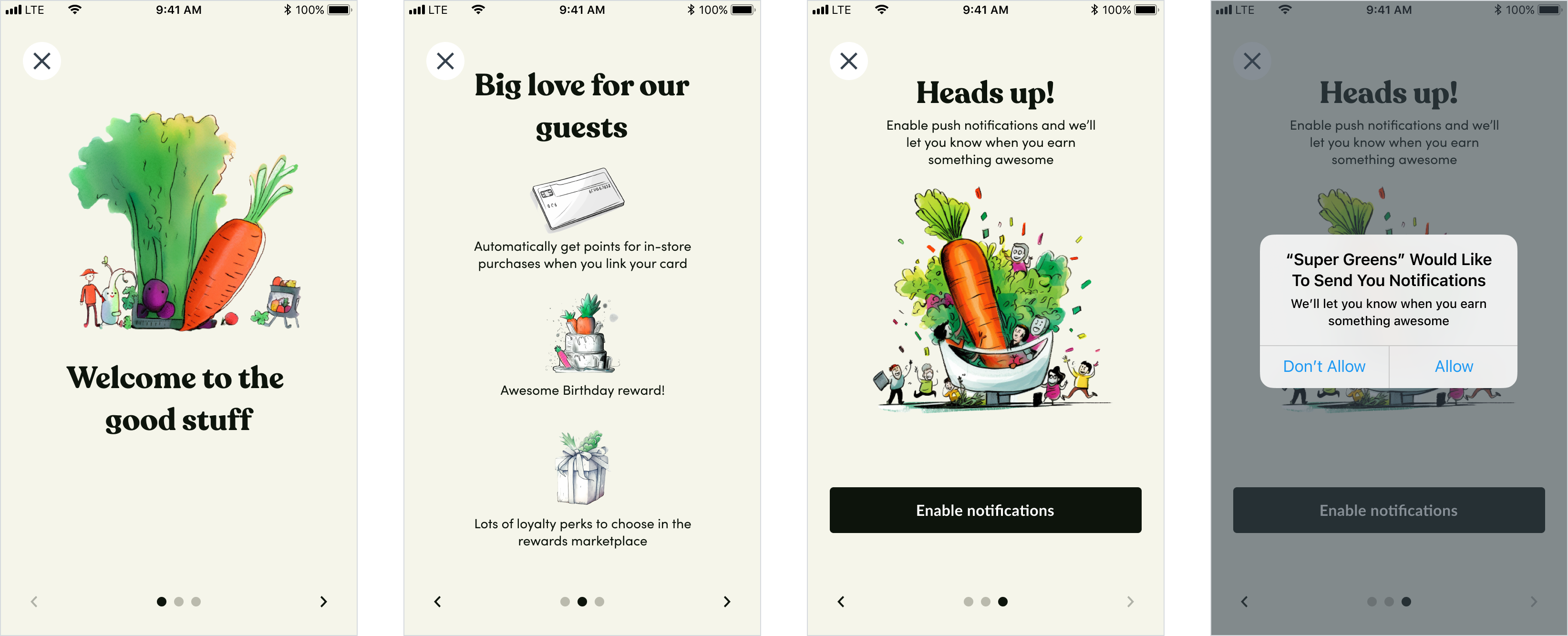
Onboarding experience
The onboarding experience can look and feel like anything you want. You may choose to focus on the welcome message, teach users how to use the app, or ask users to create an account. The experience below is how our own flows do onboarding. When users open the app, they are presented with a custom onboarding slideshow. Once they get past the slideshow—either by dismissing it or getting past the last slide—they are taken to the app’s home page. At this point the user is not logged in yet. They can access some portions of the app but not all of the app:- View the home page
- View the locations page
- View the FAQ / Support page
- View the About page
- View the menu and add items to cart
- Check out and complete their purchase (users can’t make a purchase without an account)
- View the rewards page
- View the account page
Why the sign up flow is important
Onboarding a customer into a CRM powered experience offers a trade off – share your identity and a means to contact you in exchange for rewards. Over many years Thanx has tested dozens of variations of onboarding experiences. The flows below are the current state of our own flows. As noted in our guide on Credit Card enrollment, these flows have also been approved by our card-linked partners at Visa, Mastercard, and American Express. Using these flows as they are will ensure a speedy certification of your application. Changing branding, fonts, colors, etc, are unlikely to materially affect that timeline, but wording and content should remain as they are.How Thanx does this
The signup / login flows below are presented to the user when they attempt to view the Rewards or Account pages, or tap on the Sign up / Log In links—all accessible from the nav. The signup These flows below use story telling, progressive data capture, and incentives to encourage customers to enroll in a loyalty program. There are small variations to this flow based on the following parameters:- Whether cards captured are intended to be used for payment later
- Whether a credit card is required to redeem a signup reward
- The type of signup reward
Authentication
Thanx SSO authenticates the user via a password-less flow using email authentication, rather than a password. This reduces the friction of a user having to manage yet another password as well as reduces the friction of transitioning an existing user-base to Thanx. It also makes creating an account as simple as entering an email address – as soon as one is entered, that customer can be addressed by the marketing tools. By breaking the flow out the user’s account is progressively enhanced as the user completes each screen, but the very first one – the email address – results in an addressable account.Signup and log in
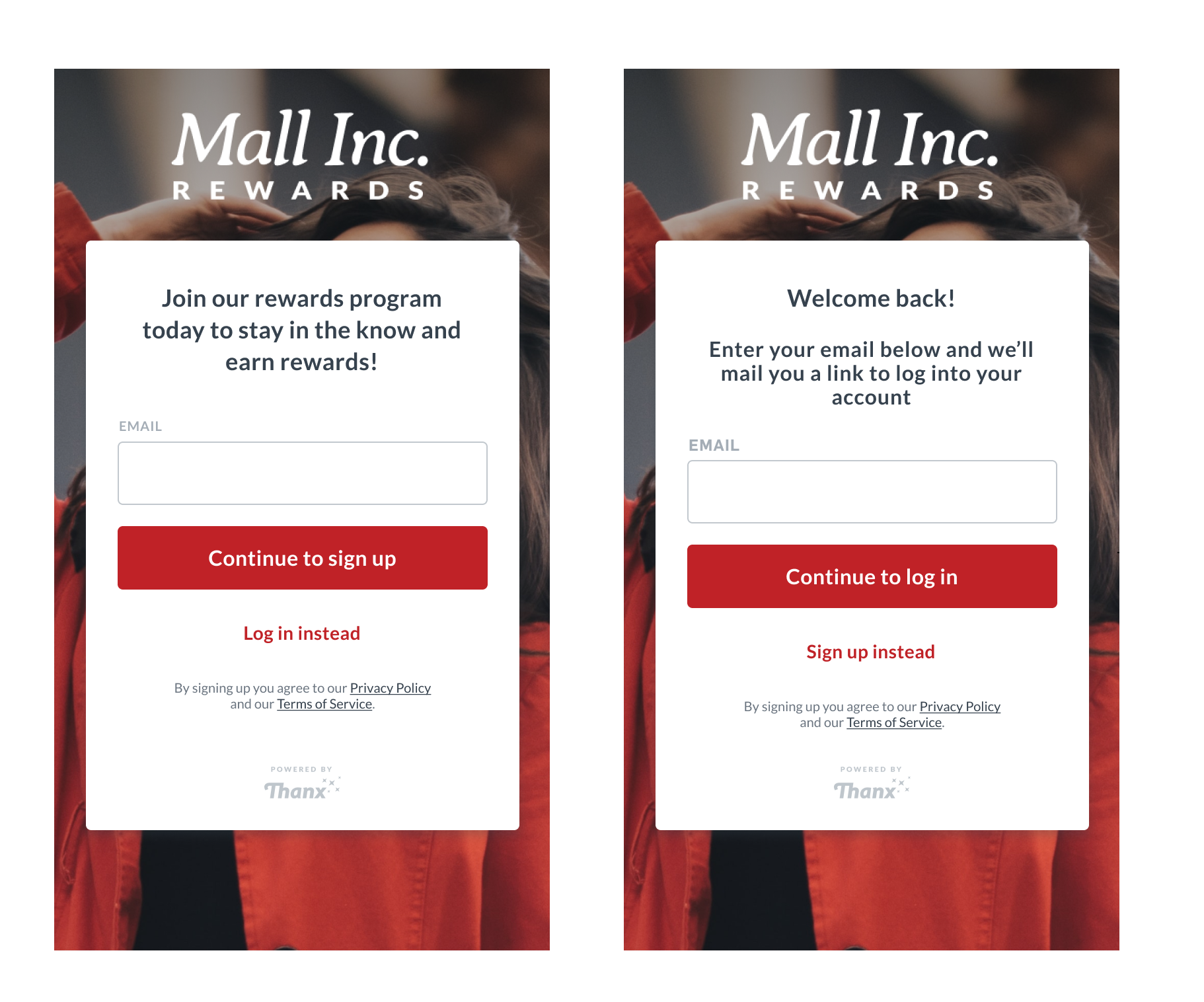
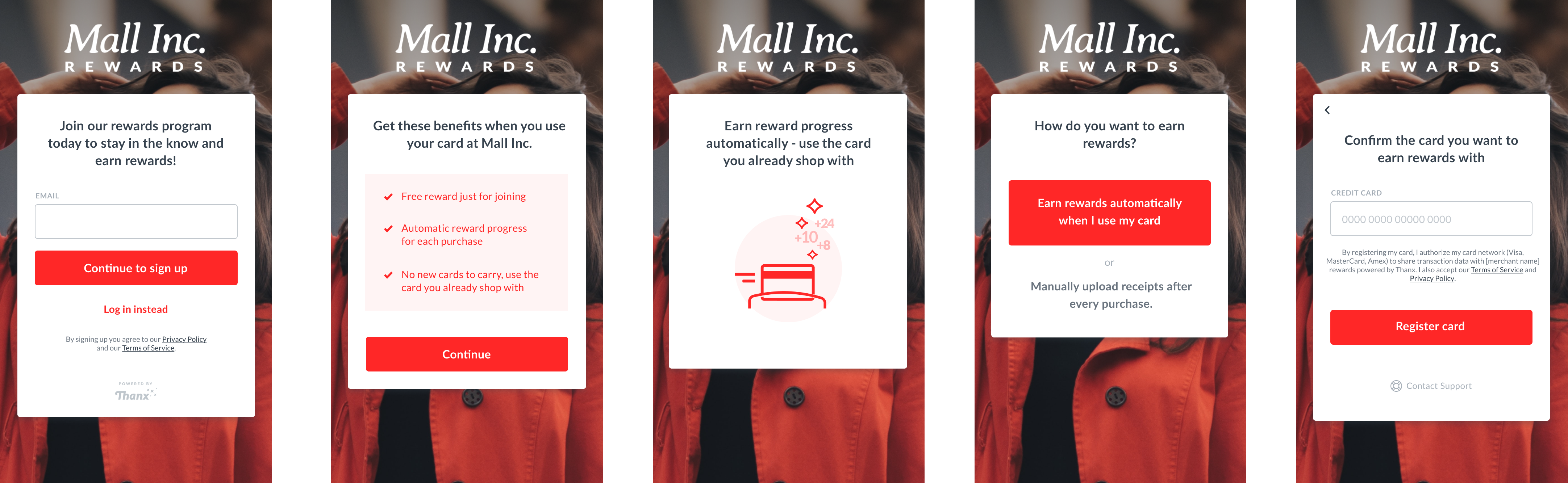
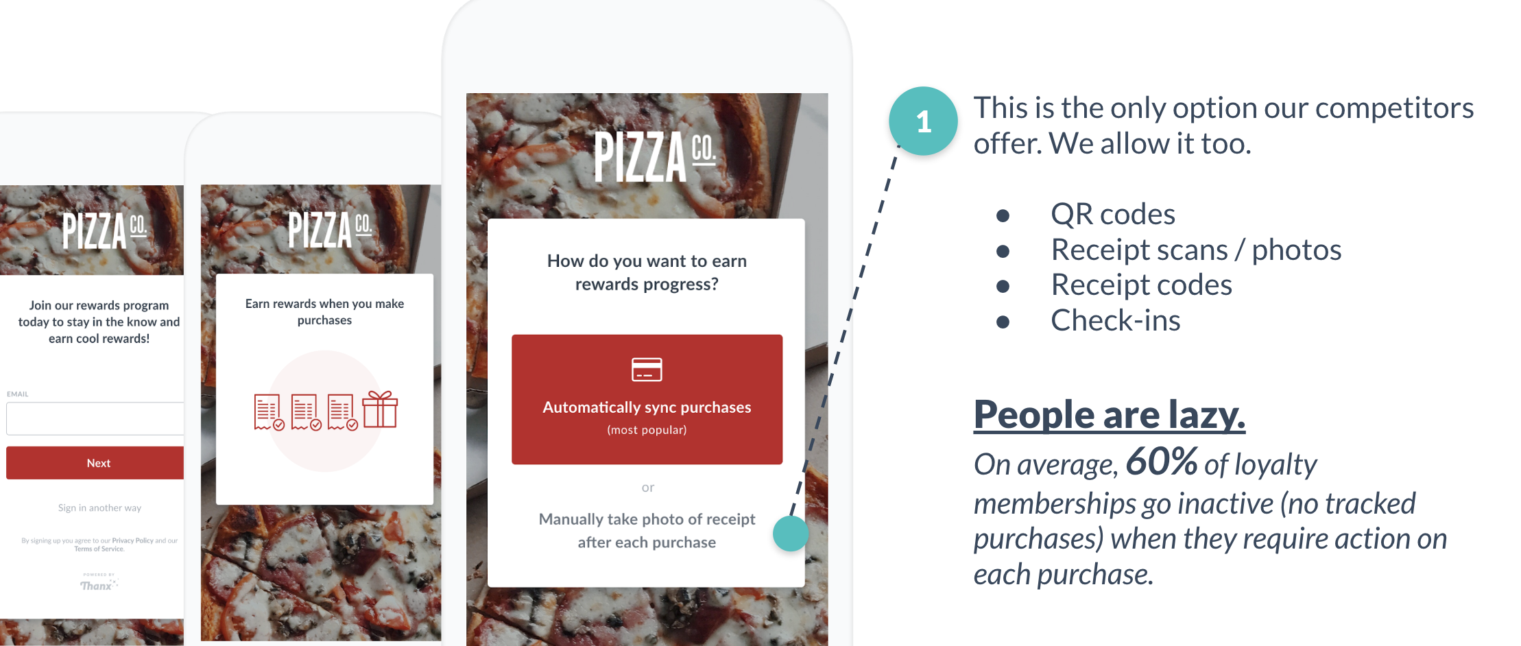
Signup flow
Non-ordering
Card not stored for payment purposesThe conversion rate of this flow (% of users who create an account who then link a card) hovers between 50% and 60% depending on the brand and the signup incentives offered.
Ordering enabled
Card stored for payment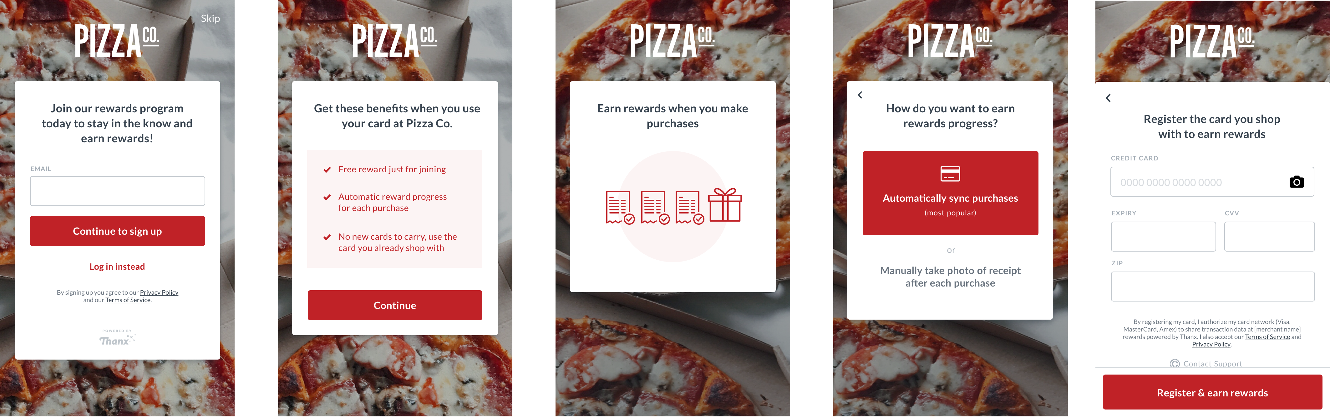
Card required
Available for ordering and non ordering experiences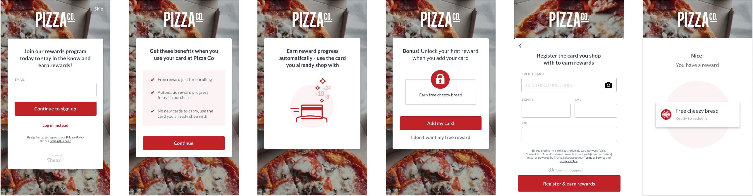
Design guidance
This flow prioritizes data capture thusly:- email – customer is immediately addressable with email campaigns.
- card number – purchases are tracked as soon as a consumer completes this step.
- name, favorite location, phone number, etc – if a customer abandons the flow before reaching or completing this step, their account is still active and tracking their purchases.
Authentication during checkout
When a logged out user moves from cart to checkout, they are presented with a simpler signup / login flow. Keep in mind the user must still sign up or log in. There is no guest checkout.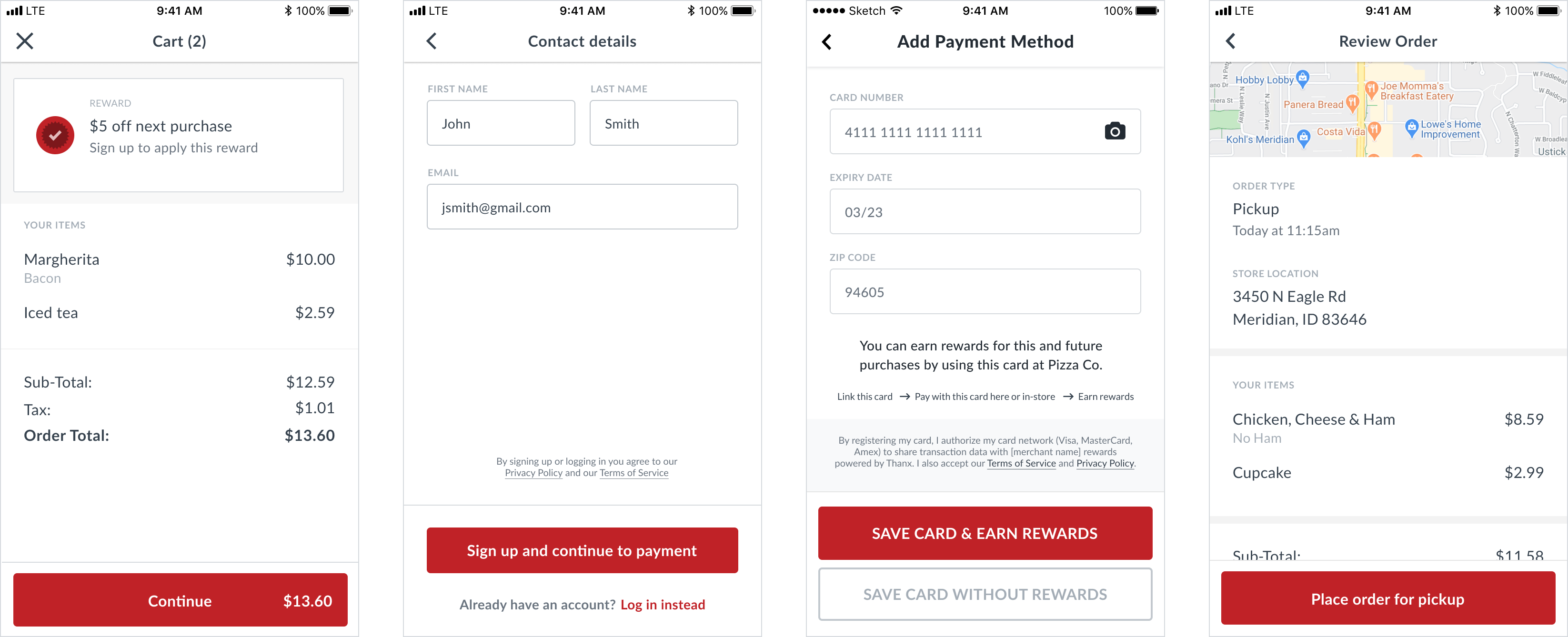
Log in
Magic link experience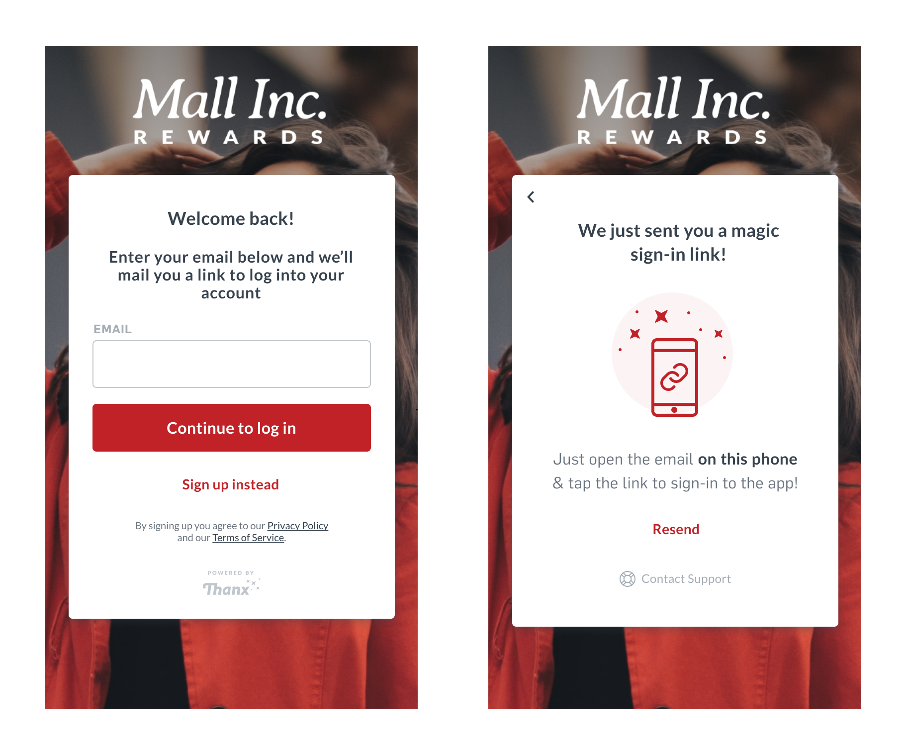
How other merchants do this
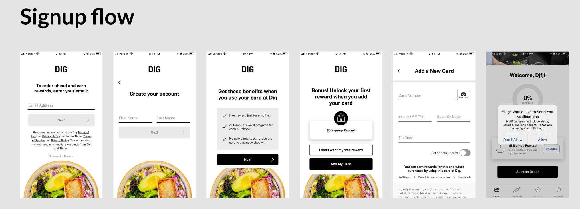
Dig app
How to do this with our APIs
In order to interact with the Thanx API you will need a user’s authentication token. This requires either that they authenticate using Thanx’s magic link technology, or that you authenticate them using your own authentication implementation. If you choose the latter, your system will be responsible for account creation and authentication. This limits which marketing tools the brand can use within the Thanx platform. We recommend that your experiences do not expire authentication tokens. This means consumers only need to register once per device. New customers do not need to authenticate at all; only those with existing accounts on file in the Thanx system. For existing customers, their linked credit cards and personal information will immediately be available to power their access to your program. For new customers, they don’t need to go click a link unless they return on another device, so long as you don’t expire their authentication token.Requirements for implementation
These are requirements that we have negotiated with our card network partners. All card enrollment experiences must be approved by these partners to use the card linked APIs they provide. While you are free to design these experiences as you like, it may produce significant delays of certification. We recommend using the designs as we have presented them to ensure a speedy deployment of your application.
- Legal text must be on any screen where you allow a customer to enter their card number and store for loyalty tracking. The legal copy may not be altered.
- Button must say “Register card”
- Legal text must be visible at all times on all devices supported
- ToS and Privacy Policy must be obviously clickable (e.g. darker and underlined)
- Must comply with standard accessibility guidelines in regards to color contrast and legibility (see: https://accessible-colors.com/)
Design tips from our team
- Fonts & colors: check font size and color contrast against accessibility standards. To check the optimal contrast for type foreground/background color you can use this tool https://accessible-colors.com/
- Buttons: should be a min height of 40px (Apple recommends 44px) for a reasonable tap area. On screens with two buttons (ordering enrollment) both must be the same size, though they can differ in visual weight (e.g. color, outline, etc).
- Forms and inputs: automatically pre-fill values in fields where possible, and let users know which fields are required (or just which are optional), and for longer forms break them down into simple steps (e.g. signup flows are better as a series of input screens).
- Error handling: be as explicit as possible so users understand why they ran into an error, and give them a means to correct or move forward from there. Include support links in critical flows, where users may need further assistance. See our API docs for how to handle error responses